The task in this course was to create a data visualization that represents information from a self-chosen dataset and include multiple layers of information. Alphanumeric characters like text and numbers should be used as sparingly as possible. Instead, color, shape, and position were to be employed strategically.
Information Design
Programming
Info
Time frame
May 2021 - June 2021
Context
Programming Project, Hochschule für Gestaltung
Tools
HTML/CSS/JS
Explanation
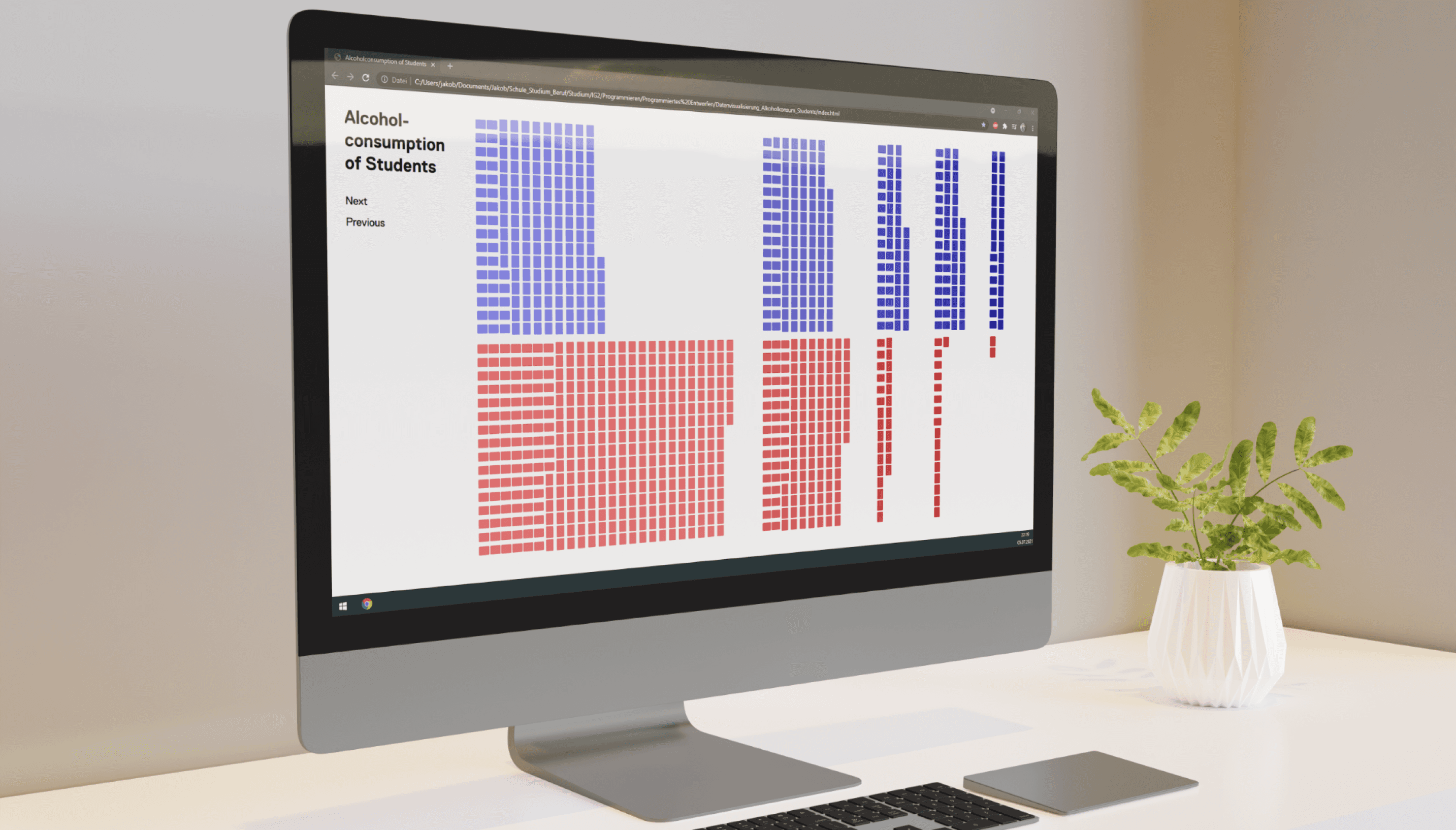
The basis was a dataset from Portugal containing data on alcohol consumption and several other parameters from 1044 students.
A color-coding scheme runs throughout the entire application. Female students are always represented in red, and male students in blue. Additionally, those with high alcohol consumption are depicted in dark shades, while those with low consumption are shown in light shades. Each layer displays alcohol consumption along with another parameter.
On the first page, the horizontal axis indicates whether the student comes from a rural or urban area. Vertical bars represent students from urban areas, while horizontal bars represent those from rural areas.
On the second page, the horizontal axis shows the final grades. Since the grading system in Portugal ranges from 0 to 20, there are 20 different fields.
On the third and final page, the age of the students can be observed.
Hovering over individual points and rectangles displays this information on the left side of the screen.